

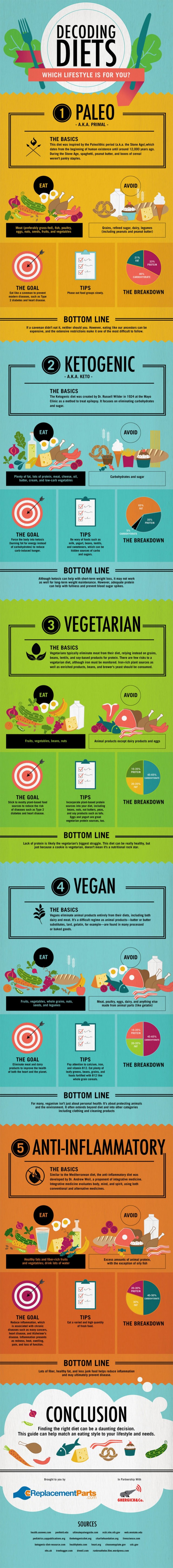
My last post regarded healthy fats, and a few months ago, I posted an extensive list of some of the major health diets and the differences and similarities between each.
I found this infographic recently and I thought it was a cool visual representation of common health diets and what they suggest emphasizing and avoiding. It also has handy macro references for how much protein, carbohydrates, and fat are normally consumed by the adherents of each diet.
If you ever feel overwhelmed and confused by different diets out there, this might help you visualize what each one offers. Remember, while you might have certain health issues that would make certain diets better or worse for you, for the most part if you are in good health and simply want to eat a cleaner, more healthful diet, then you should definitely do what works for you. You’ll have more success if you’re eating the (healthy) food you love, and not restricting yourself to things you know might trip you up. The best diet is one you can stick with, so be realistic!
Hope this infographic, found on DailyInfographic.com (source unknown), can be helpful for you.
If you enjoyed this, you might also like….
")
")
")
")